I am really enjoying learning about Responsive Web Design and happily applying this to my current client. There is a whole bunch of information available all over the web. Companies like Template Monster have begun to roll out some beautiful examples of templates focused on the concept. (They have some other cool free HTML5 designs too, they are not responsive though.) In doing my research I found Kyle Schaeffer’s site and his V5 Responsive Master. I like the clean look, and as a starting page, it provides a good start. As a “search guy” the problem I find with most (if not all) Master Pages provided on the Web is that none that I have found address the Search Center. The authors stop short of a “complete branding solution” by simply rendering a home page and a few publishing pages. (Many I have found will not even render the other default publishing pages like Press Releases.) I don’t mean to be critical of Kyle’s work, I think he did a great job, I mean to call attention to the failure of designers in general who ignore (or just don’t know SharePoint well enough to pay attention to) the Search Center.
The Issue
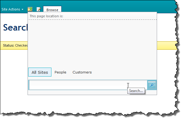
It’s not their fault. The Search Center is a finicky site. Out of the box the Search Center uses “minimal.master”. Of course this causes the Search Center to have a different look and feel (and navigation) than the rest of the site. Since the Search Main page, Search Results page and People Search Results page all have different corresponding Page Layouts it becomes increasingly complicated to manage the branding for the site. These page layouts have some major flaws in their layout that have been present since the search center was initially introduced. For example the search box control is in the Breadcrumb placeholder control. This means that an unwitting designer who decides to remove the breadcrumb from the master page is inadvertently removing the search box from every search page. My favorite evidence of this is if you apply “nightandday.master” to the search site the search box control vanishes. Click the breadcrumb folder in the menu and “Thar she blows!” See! This is even a challenge for the designers at Microsoft!
The Solution
The resolution to the issue is actually quite simple. Have your designers plan to spend time designing the Search Center. Don’t create a unique master page for the Search Center. Create page layouts that work for the search center. That means either including the BreadCrumb placeholder or changing the Search Page Layouts (which is what I do because on a branding project we’re already creating a bunch of page layouts.) Here is what I do:
-
Create a copy of the 3 Search Page Layouts: Search Main, Search Results and People Search Results (I prefixed them with “V5”.)
-
For each page, check them it and add a comment to the top of the PlaceHolderMain content control like
<!-- V5 Search Page -–> -
Save the files.

-
Return to the Page Layouts folder and retitle each file so you can tell them apart from their out of the box counterpart. In SharePoint Designer I do this by clicking on the Title column for the file and prefixing it with “V5”.

-
Check all three files in and publish a major version.
-
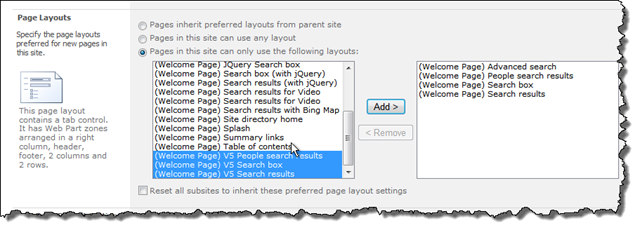
Now we just have to apply our new page layouts to the corresponding Search Center Pages. By default the Search Center only allows certain Page Layouts to be used. We have to add our Page Layouts to the approved list. Navigate to Site Settings | Page Layouts and Site Templates and locate the three new Page Layouts and move them to the “approved” side with the Add button.
-
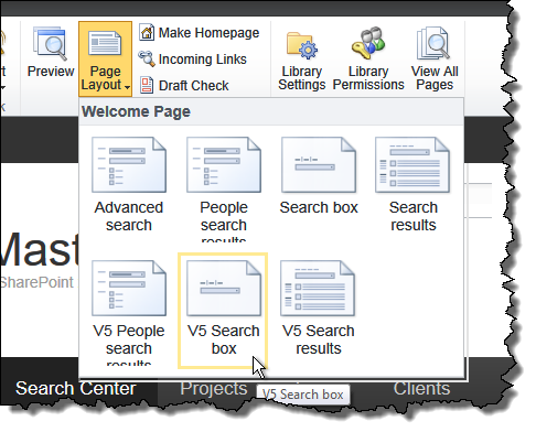
Navigate to the search page, choose Edit and change the Page Layout to use your new V5 Page Layout. For the Search page choose “V5 Search Box”, for the results page “V5 Search Results” and the People Search Results page choose “V5 People search results”.
-
Save the changes to the page and Check it in.
-
Nothing has changed, has it? View Source on each page and you should find your comment, if not you missed a step and there is no point in going further until you get this first part right. If you have the right changes for all three pages you are ready to proceed to actually making the changes necessary to “Respons-i-fy” your Search Center.

Making the Search Center Responsive
The rest of the work is pure SharePoint Designer Page Layout work. At this point you can just create what is essentially a web part page and forget about all the rest of the markup. If you decide to reuse the base page layouts here are the high points (I’ll provide the files at the end):
Search Main
-
Remove all of the UIVersion=“3” declarations. Were going to own this page. We don’t need version 3 (or 4 for that matter).
-
Remove all the styling from PlaceHolderAdditionalPageHead and replace it with the necessary CSS to make the page work (see my files below).
-
Remove the PlaceHolderPageTitleInTitleArea content (unless you like it…)
-
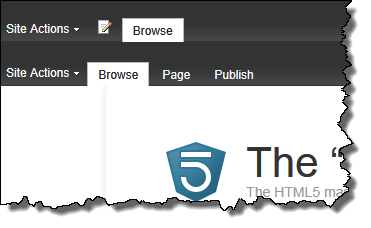
Remove the Content control for SPNavigation. This is the cause of the doubled top navigation that you may be seeing. In the V5 master it contains a necessary publishing control.
-
Move the contents of the Content control PlaceHolderTitleBreadcrumb into the PlaceHolderMain content control. For the sake of this demo I just pasted it all in and did not change anything. In reality I would remove the tables in favor of divs and change the layout.
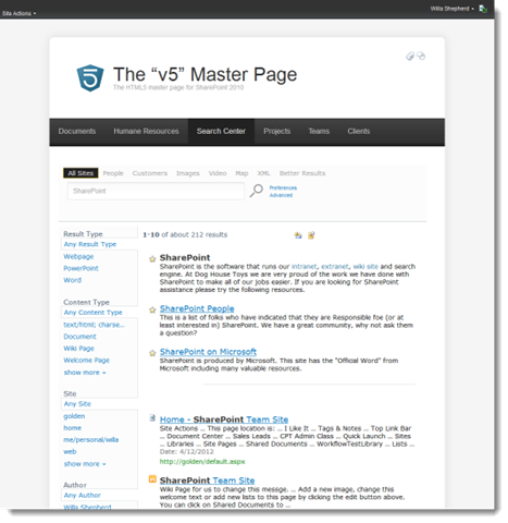
At this point I have whittled the page down to about 94 lines from the original 331. The end result is this:
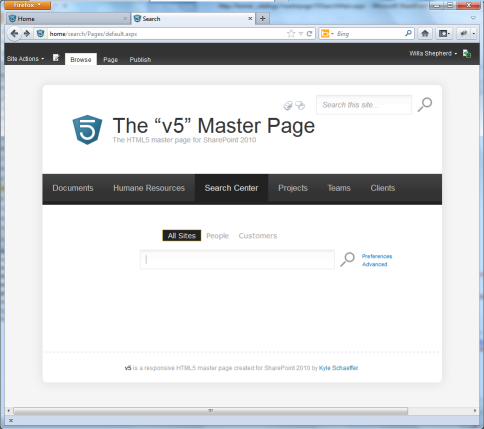
You will notice the duplicate Search Box. This is because the original V5 master page omitted the PlaceHolderSearchArea. If you add the Content Place Holder back to the master page you can achieve the effect of removing the top navigation search box while in the search center. Use code like this in the V5 Master Page:
<div id="v5-search">
  <!-- search -->
  <asp:ContentPlaceHolder id="PlaceHolderSearchArea" runat="server">
    <SharePoint:DelegateControl runat="server" ControlId="SmallSearchInputBox" Version="4"/>
  </asp:ContentPlaceHolder>
</div>
Search Results
It’s pretty much the same process here. Start by getting the structure right then come back and style the web part XSL to work for the results if you need to.
-
Remove the extra crud you don’t need. I remove all static web parts at this point. This significantly cuts down on the code for the page and enables me to focus on the page layout. I can always add them back later if I need to. (3696 lines whittled down to 89 lines.)
-
Move the content from PlaceHolderTitleBreadcrumb to PlaceHolderMain.
-
Remove everything from PlaceHolderAdditionalPageHead and replace it with the necessary CSS to override the styles.
At this point you should have a search center results page that looks like it belongs to your Web site.
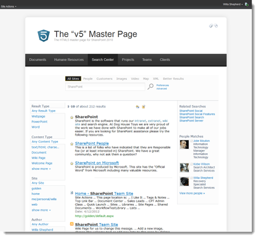
People Search
Of course we cannot forget about People search results! By now you should be able to recite the necessary changes. Repeat after me:
-
Remove the extra crud you don’t need. (Including all of the static web parts and UIVersion=3 content.) I also clear the PlaceHolderPageTitleInTitleArea and other controls I know I won’t need. Your mileage may vary. My page is down to about 100 lines.
-
Move the content from PlaceHolderTitleBreadcrumb to PlaceHolderMain.
-
Remove everything from PlaceHolderAdditionalPageHead and replace it with the necessary CSS to override the styles. (Or link to a central CSS file.)
-
Remove the SPNavigation content placeholder you don’t need the extra navigation.
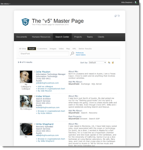
Again, with a bit of work you should be able to get something that looks like it belongs on the site and is not an afterthought.
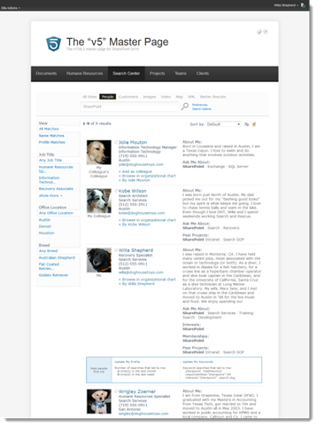
Additional Tips
Keep in mind that the controls on the Search Pages are just Web Parts. So If you find that you are seeing double, you may have inadvertently created new instances of web parts on the page. Just edit the page and delete the extra web parts.
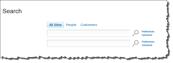
You will spend most of your time troubleshooting the default SharePoint page rendering and styles. I hate this, but it’s the cost of playing in the SharePoint world. In these sample files I embedded all of the necessary CSS changes into the Page Layouts themselves, I would not do this in production. I would just create a new CSS file like “V5Search.css” and link each page layout to that file. I only used this technique here to show what overrides were necessary for each type of page. I rely heavily on Firebug and IE Developer Toolbar. If you have not used these tools now is the time to learn them.
Final Results
You have to design your site to suit your specific needs. I guarantee that the solution I present here will not work for 100% of you 100% of the time. This is just intended to show you that it is possible to include the Search Center in your plans for a responsive web site.
Desktop Layout
The desktop layouts are the images I presented above. The real magic is when you start using a smaller viewport like a tablet of smart phone.
Tablet Layout
For the tablet I chose to remove the right column. This removes the Post-query Suggestions and People.
For the People Results I removed the refiners, you could choose to remove the About Me column and leave the refiners if you wish. The cool thing about this approach is the choice is yours.
Smart Phone Layout


Conclusion
While it is true that working with the out of the box pages can pose a steep learning curve, there is nothing preventing you from creating your own pages. In all of my projects I create all of my page layouts to go with my master pages and avoid using the out of the box pages. The only reason I did it here for this demo is to provide a starting point for your own exploration of the topic. Here are the pages that I used to create this demo.
I also have to mention that having the “right” resources is necessary in any SharePoint project. In my case the right, perfect, most excellent resource was Matt Schoen. Matt was able to take my jumble of CSS and make it make sense. He has the uncanny ability to take CSS that I have been looking at for an hour and spot the problem in seconds. I could not have finished this post without his assistance. Now if I could just get him to share his knowledge with the rest of y’all…