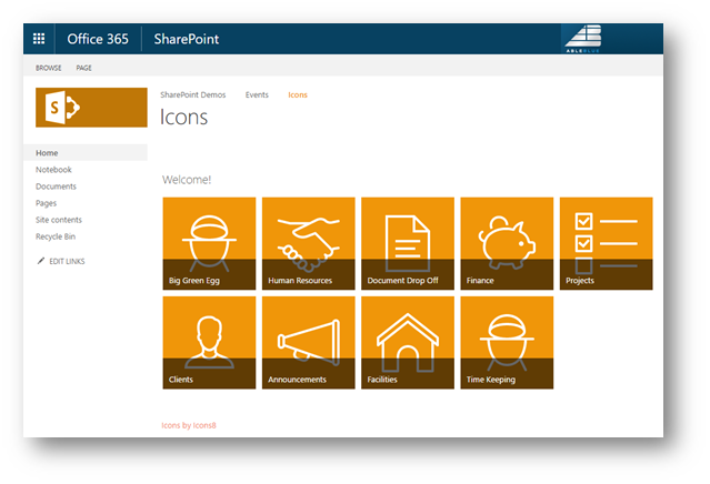
Congratulations! You have a new team site. Right there on the home page is that beautiful Getting Started web part. Have you ever thought, “I like the way that looks. I want that for my visitors!”. You start poking around and find that it’s a bit more complicated than you thought. In fact, the “Getting Started” web part isn’t even where you start. In this post, I’ll show you a couple quick tips to create a great looking iconic navigation system for your site. In less than 10 minutes.

Getting Started
To get started click the “Remove This” link on the Getting Started web part. You don’t need it. Next, decide on where you want to send your users. In my case I have pages for Clients, Projects, Finance, Document Drop Off, Human Resources, Time Keeping, Facilities, Big Green Egg. and Announcements. At this point you have two choices: 1. Draw all of those concepts as white icons and then save them as .PNG files with a transparent background 150 pixels square. (Go ahead, I’ll wait.) Or, cheat.
The Most Perfect Icons Site
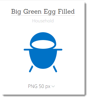
If you have ever done an internet search of icons, you have discovered there is a LOT of crap out there. Search no more, just go to Icons8. This site was delivered to us from heaven and is staffed by funny, creative, totally irreverent characters, who love what they do. For our purposes, you can get all the icons you like, for free as long as you don’t violate the terms of use. (This means providing a link to their site from where ever you use the icons.) If you want to take your Icon frenzy to the next level, I urge you to sign up for the unlimited plan. With Unlimited you can get any icon in any format and size, meaning you can edit their work. Oh, and did I mention you can even submit a request for an icon if it does not exist? I feel responsible for there being a Big Green Egg icon.
Create Your Icons
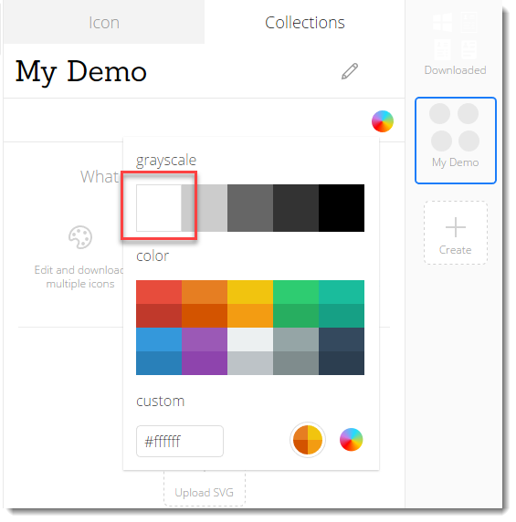
- Start in Icons8 by creating a new Collection.
- Give your collection a name and set the icon color to White.
- Using the Search feature of Icons8, locate your first icon.
- Select the icon to add it to your collection.
- Set the size and type to PNG 100 px.
- Continue searching and selecting icons to complete the list of navigation concepts.
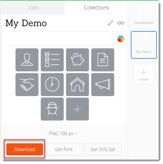
- Once you have all the icons you require, click Download.
One Final Edit
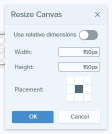
You can use the icons as they are, but they will look better with one final tweak. They need to have the canvas resized for 150 x 150 pixels. For this you can use any image editing tool. Here I use TechSmith Snagit Editor.
- Load the files into the editor.
- Choose Image Resize Canvas…
- Set the dimensions to 150px by 150px and Save the image. Lather, Rinse, and Repeat for the other images.
- Upload the images to a central location on your site. In this case I used the asset library.
Create the List
OK, the hard part is over. All you need to do now is create the list and supply the links to the destinations and icons.
- On the site, choose Site contents.
- Click New | App and choose Promoted Links.
- Supply a new name, like “Links”, and click Create.
- Navigate to your new list and choose the All Promoted Links view. All you need to do now is add an item for every icon.
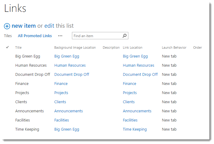
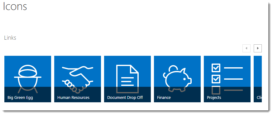
- Switch to Tiles view to see the results of your efforts. Test your links to be sure everything is correctly linked.

- Return to the Home Page (or wherever you plan to put the links) and click Edit. On the Insert tab, choose App Part and select your Links list. Click Add to insert the App part on the page.
- Click Save to save your work.
Wrap It Up
At this point I am sure you are scratching your head wondering where your icons went. Well, they are all there, just hidden. Lame, I know…but the fix is easy.
- Edit the page again and Insert a Script Editor web part. It’s in the Web Part Gallery under Media and Content. Click Add.
- On the Script Editor Web part, click Edit Snippet and add the following CSS and the required link to Icons8.
<style type="text/css">
.ms-promlink-body {max-width:100%;}
.ms-promlink-headerNav {display: none;}
</style>
<a href="http://icons8.com" target="_blank">Icons by Icons8</a>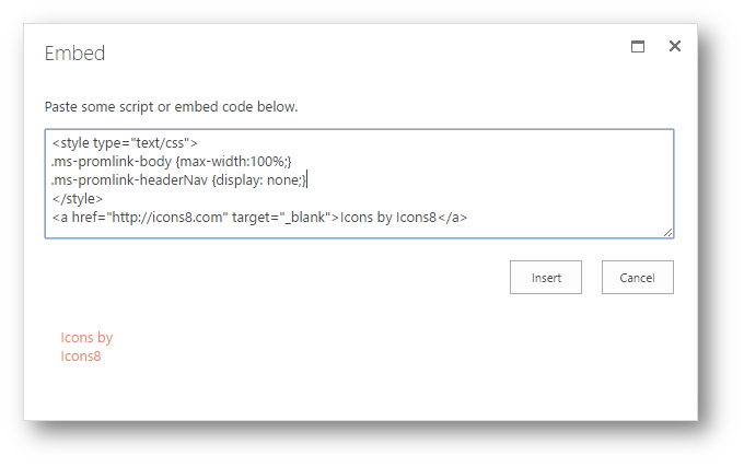
- Click Insert to save the change. Click OK to save the Web part properties.
- Optionally, you can edit the Title of the Links Web part to be a bit more inviting. The final result should look great.
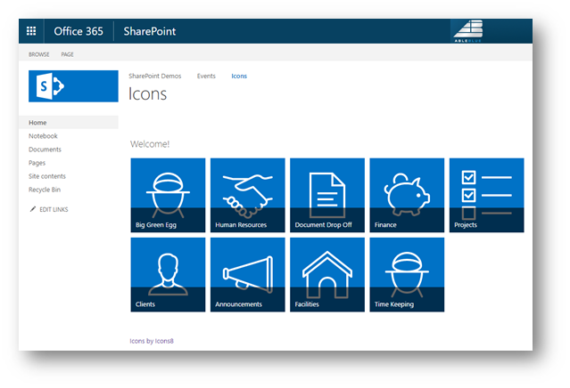
The side benefit of all this work is by choosing to use transparent icons provided by Icons8, you don’t have to change a thing when the Composed Look changes.
